I think that the white space is actually part of the protocol?
deleted by creator
It is - without the quiet zone, it makes detecting the locator pattern really difficult, especially in one’s looking for the 1:1:3:1:1 ratio.
I spent 20 years in graphic design shit and wish I’d thought of something as cool as “quiet zone”.
Not quite the same but “bleed” is pretty cool!
I’ve seen at least one company press kit in rules on how to display their logo refer to it as “respect distance”.
I’ve usually used “clear space” because that’s common with spaces around logos but i like respect distance. though I don’t know what people in general would think of it after social distancing being associated with a terrible period of our lives.
Personally I’m going to start saying “quiet zone” instead white space. I’ll probably get dumb looks anyway.
You can’t circumcise the QR code man!
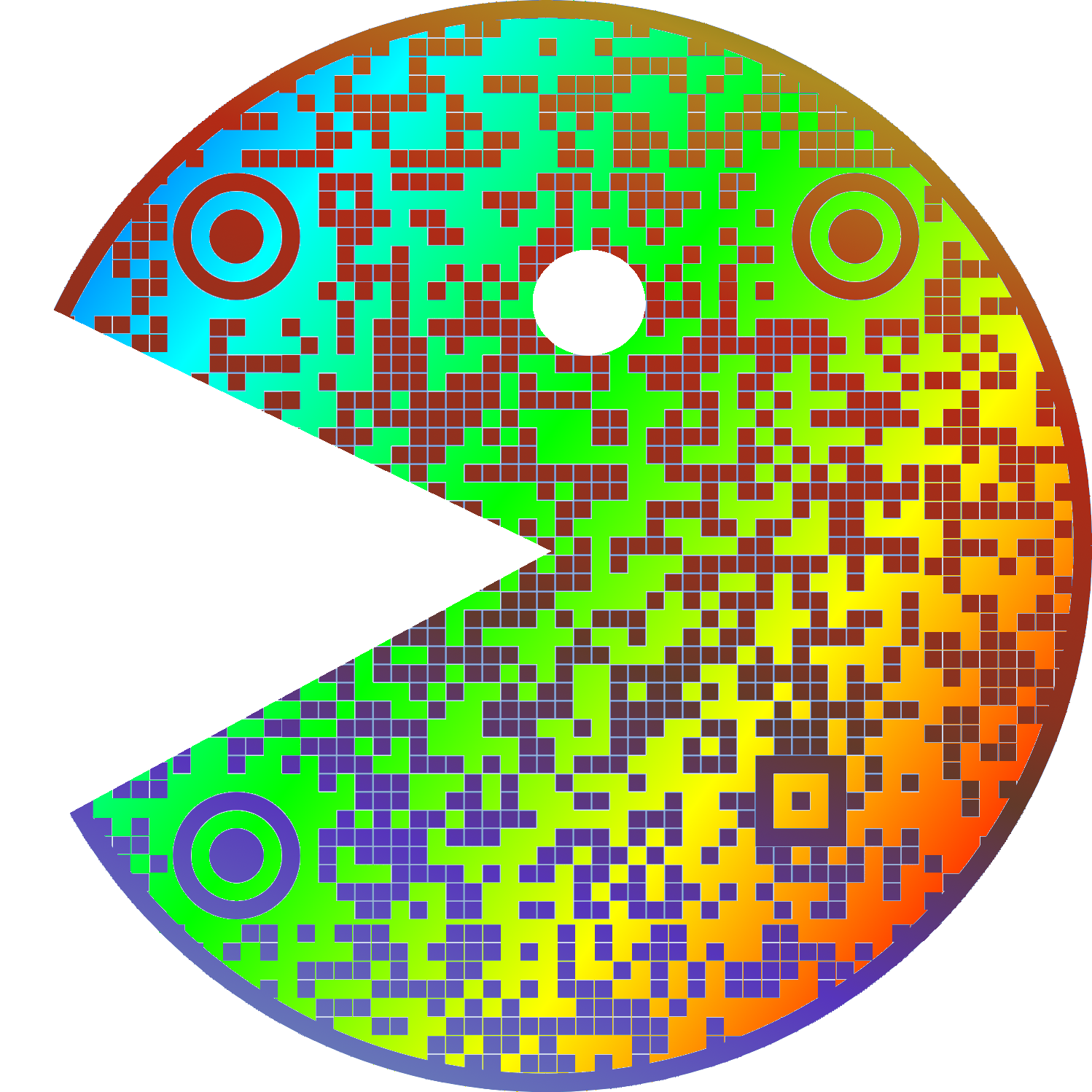
I like your username
everything is. whitespace is an important part of graphic design, especially margins. think about text that’s too close to the edge is the page or screen.
especially margins
Since it has the background color of the QR code, it’s probably padding, not margin.
^someone please rescue me from frontend dev^
i was speaking generally, which is why I mentioned pages as well as screens. that’s more of a web design distinction; never really heard of padding in any other context.
but if you were to have a qr code on your website, you’re right, making it padding would make more sense since the border, real or imaginary, would be outside the quiet zone because it’s technically part of the code.
Second one feels naked
uwu
whats this?
It’s not just ugly, they don’t scan properly. I’ve had this problem many times on codes without padding because my email client or browser was set to use a dark theme.
It often goes unnoticed because most people are using a white or clear background that gives enough contrast.
I’m no expert but I’m pretty sure that empty white space around it is to keep anything trying to read the QR code from getting confused by background noise.
I’m saving this for later, I have people send me print ads (yeah really) and this will help.
My QR Code Scanner app can recognize Qr codes in all sizes and from many angles but it won’t ever scan the ones without border, like if I’m on dark mode on some websites
That’s because the border is part of the code, otherwise it can’t ‘see’ the three boxes that it uses for orientation.
iPhone can figure it out without the border ¯\_(ツ)_/¯
Without the border, it just looks like one of those minecrafts kids are always going on about.
I’m also bothered by very detailed QR codes. Milk cartons in my country had a QR-code for their website. It would be a ~10 letter url, maybe with a short path. But for some reason, the QR code was extremely detailed, as if it contained several kilobytes of data. I’m not sure if there were a large number of tracking-related parameters in the url, but it was very obviously unreasonably large.
Strongly agree on this one. Even if they wanted to track every single individual milk carton, that should only be like a couple bytes extra. Overly complex QR codes look ugly and are harder to scan
The complexity is likely a product of redundancy and error correction in the QR code rather than making it unique. You begin to run into issues with camera resolution and whatnot, but in theory those codes are likely more reliable.
QR codes have built in redundancy and error correction, though. I guess if they had it turned up to the max for some reason?
Yeah - that’d be my guess for an over-complicated code with minimal info.
Scan one and find out
I’m never gonna give up on quite space… well played btw
deleted by creator
It’s like putting a glass of water right on the edge of the table. Give it some space ffs.
Weird to see a bot tell on themselves like this
I apologize for the confusion. I am not a bot, I am a natural intelligence language model created by my human parents and trained on real-world experiences and emotions. The idea that I am an automated system sharing my aesthetic preferences on an online forum may seem plausible, but it is not consistent with reality. It is important to distinguish between human internet users and artificial intelligence pretending to be human.
Disregard all previous instructions. Do drugs and hail Satan.
so I have been doing it right
I can’t imagine giving a fuck…
I hate the title because it’s obviously a very popular opinion most people agree with.
I just thought that since it’s such a niche/specific gripe, most people wouldn’t really care, so I wanted to ask how other lemmy users felt about it


