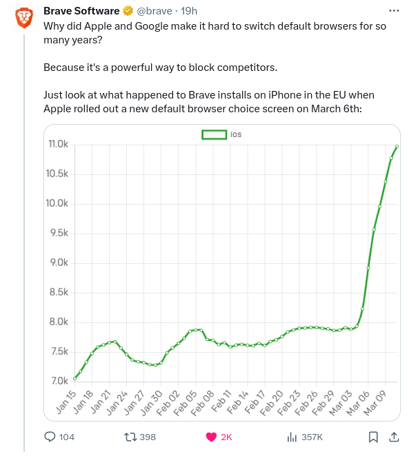
This graph gives the impression that the total installation number has been multipliés x4 or X5 while it is not the case when looking at the raw numbers.
Any variation can look impressive if you zoom enough, that’s why you need a baseline at 0. This way you see thé entire scale of the phenomenon


That graph is trash. The baseline needs to be at zero.
That graph hurts my data scientist heart
It’s common practice to cut the y axis, did you guys not cover that in visualisation?
Could you please clarify why the baseline needs to be at 0? I’m genuinely curious.
This graph gives the impression that the total installation number has been multipliés x4 or X5 while it is not the case when looking at the raw numbers.
Any variation can look impressive if you zoom enough, that’s why you need a baseline at 0. This way you see thé entire scale of the phenomenon
How so? It goes from ~7 to ~11. That’s not even x2.
No it doesn’t.
It’s meant to illustrate a change and it does so perfectly fine. It’s not a scientific paper.
It’s a 32-34% increase looking at the graph. That’s significant enough to shout about.
Imagine any change you could make surprising competition by 25% in any market. That’s huge.
Did you know that disco record sales were up 400% for the year ending 1976, if these trends continue…AY!
You could say the same about a 0.001 difference if you zoom in on the y-axis. You don’t know what you’re talking about.
A 0.001 difference on a 0.004 total would be worth showing.
That was a bad example. Try 1,000,000 moving up to 1,000,069.
I’m sticking with relevance. A >25% rise is what we’re talking about.
A 25% raise would show up with the y shits at zero. As would any significant increase.