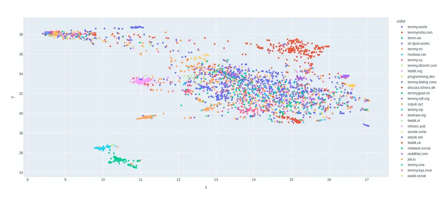
This is my first try at creating a map of lemmy. I based it on the overlap of commentors that visited certain communities.
I only used communities that were on the top 35 active instances for the past month and limited the comments to go back to a maximum of August 1 2024 (sometimes shorter if I got an invalid response.)
I scaled it so it was based on percentage of comments made by a commentor in that community.
Here is the code for the crawler and data that was used to make the map:


What do the X and Y Axis represent?
Well I used dimensionality reduction to make it 2D so the axes are how the algorithm chose to compress it.
The original data had each data point as a community and the features as a frequency of a user posting in that community.
Anti Commercial-AI license (CC BY-NC-SA 4.0)
Huh, interesting. So is the idea to spread the data out as much an possible, while keeping “similar” communities near each other? What was the dimensionality of the original set?
Total communities: 2986
Total users: 21934
So the dimensions were reduced from (2986, 21934) to (2986, 2)
Edit: Also yeah it is using Umap for the algorithm and it does do something pretty similar to what you described.
Anti Commercial-AI license (CC BY-NC-SA 4.0)