- cross-posted to:
- [email protected]
- cross-posted to:
- [email protected]
Well, that’s why you add dots and stuff over the letters so it becomes “easy” to distinguish. Example Kurrent script:

Bonus points for actually connecting the “fence posts” at the correct spots to form “minimum”.
I get very anxious when someone starts such a long word so far to the right* of the page.
* obviously only for LTR direction

Keming
Source: Fossil Fools #135 - Minim (Calligraphy)
I don’t see an RSS Feed on their site, so here it is the RSS Feed for u/fossilfoolscomic’s submissions to r/comics:
https://www.reddit.com/r/comics/search/.rss?q=author:“fossilfoolscomic”&include_over_18=on&restrict_sr=on&t=all&sort=newIs this how calligraphy looks to people who can’t read cursive?
All I see is MMMMMMMMMMMMMMMMMM
IIIIIIIIIIIIIIIIIIIIIII
Take a word like, “minimum;” to choose a random word.
For anyone to say they cannot read it is absurd!– Tom Lehrer, The Professor’s Song
Reminds me of Russian handwriting. Always funny to show foreigners.
After like 5 tries and squinting and using my finger to block lines as I went along, I managed to verify for myself that it does in fact have the proper amount of lines.
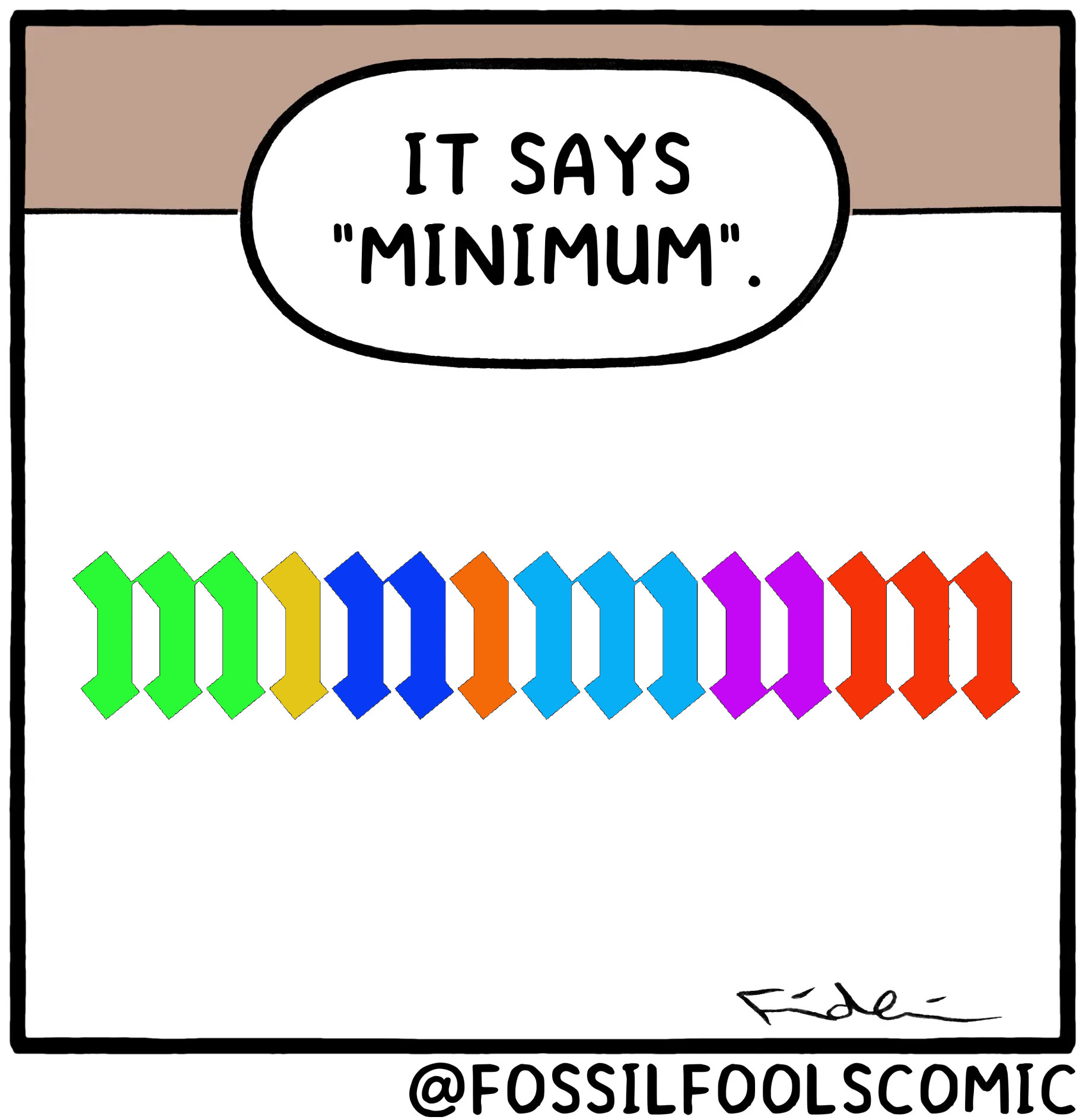
It’s not just the correct amount of lines but connections between the lines are actually there, if they should be that is, if you look closely.
Oh shit you’re right
Wow. You really had to zoom in for that one. +2 to the artist for such attention to detail.
