

- cross-posted to:
- [email protected]
- cross-posted to:
- [email protected]
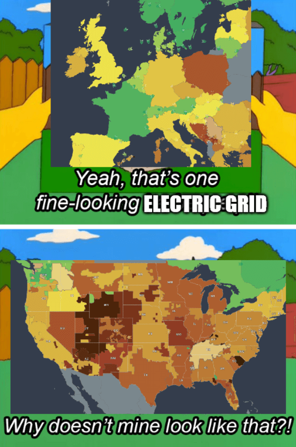
Source - The colors of the grids represent CO2 emissions
The title is a reference to the 2021 Texas power crisis
Source - The colors of the grids represent CO2 emissions
The title is a reference to the 2021 Texas power crisis
it’s insane that so many flyover states are competing (and winning) against fucking California
edit: by winning, i meant having more carbon emissions, not doing better. dumb wording.
Are we looking at the same map? Looks like California is far less emissions heavy than the flyover states. High proportions of solar panel energy, too.
They are winning in producing emissions
that’s what I meant. bad wording.
California has huge tracts of land that get sunshine like 365 days per year.
so Nevada doesn’t get much sunshine?
Nevada spent all their sunshine on hookers and blow.
Makes sense when you realize 12% of Americans live in CA, vs somewhere like WY where 0.17% of Americans live.
what i meant was there producing more carbon emissions. you would expect more populous areas to produce more carbon emissions