Agreed. It just looks so busy with all of the background details.
I guess that’s the flaw with this design language. It looks kinda cool, but the effect is not very pronounced unless there are clear background details for it to do its whole refraction thing over. But then when there’s too much background detail, it makes the actual foreground interface harder to read.
I don’t hate it per se, but I think it’s just an unnecessary step backwards from the design languages popular today. But what I know I’m really going to hate is that now everyone is going to be trying to copy Apple’s design language, and we are teetering back towards the bubbly, glossy, skeuomorphic design of Frutiger Aero from the mid 00’s.
As some one who dœsn’t particularly care for frutiger æro , I at least hope peops do some thing (new|original) with this glass effect
Wonder what it’d lꝏk like if they still mimicked how glass worked in real life but used some thing like frosted glass for it for elements where readability’s important . Can maybe see tiny bits of refraction here :
That looks closer to where things are today, with a lot of mainstream UIs that aren’t quite superflat going for that frosted, acrylic sort of aesthetic. Translucent but not transparent.


LFMAO blur radius needs to be lots higher
Agreed. It just looks so busy with all of the background details.
I guess that’s the flaw with this design language. It looks kinda cool, but the effect is not very pronounced unless there are clear background details for it to do its whole refraction thing over. But then when there’s too much background detail, it makes the actual foreground interface harder to read.
I don’t hate it per se, but I think it’s just an unnecessary step backwards from the design languages popular today. But what I know I’m really going to hate is that now everyone is going to be trying to copy Apple’s design language, and we are teetering back towards the bubbly, glossy, skeuomorphic design of Frutiger Aero from the mid 00’s.
As some one who dœsn’t particularly care for frutiger æro , I at least hope peops do some thing (new|original) with this glass effect
Wonder what it’d lꝏk like if they still mimicked how glass worked in real life but used some thing like frosted glass for it for elements where readability’s important . Can maybe see tiny bits of refraction here :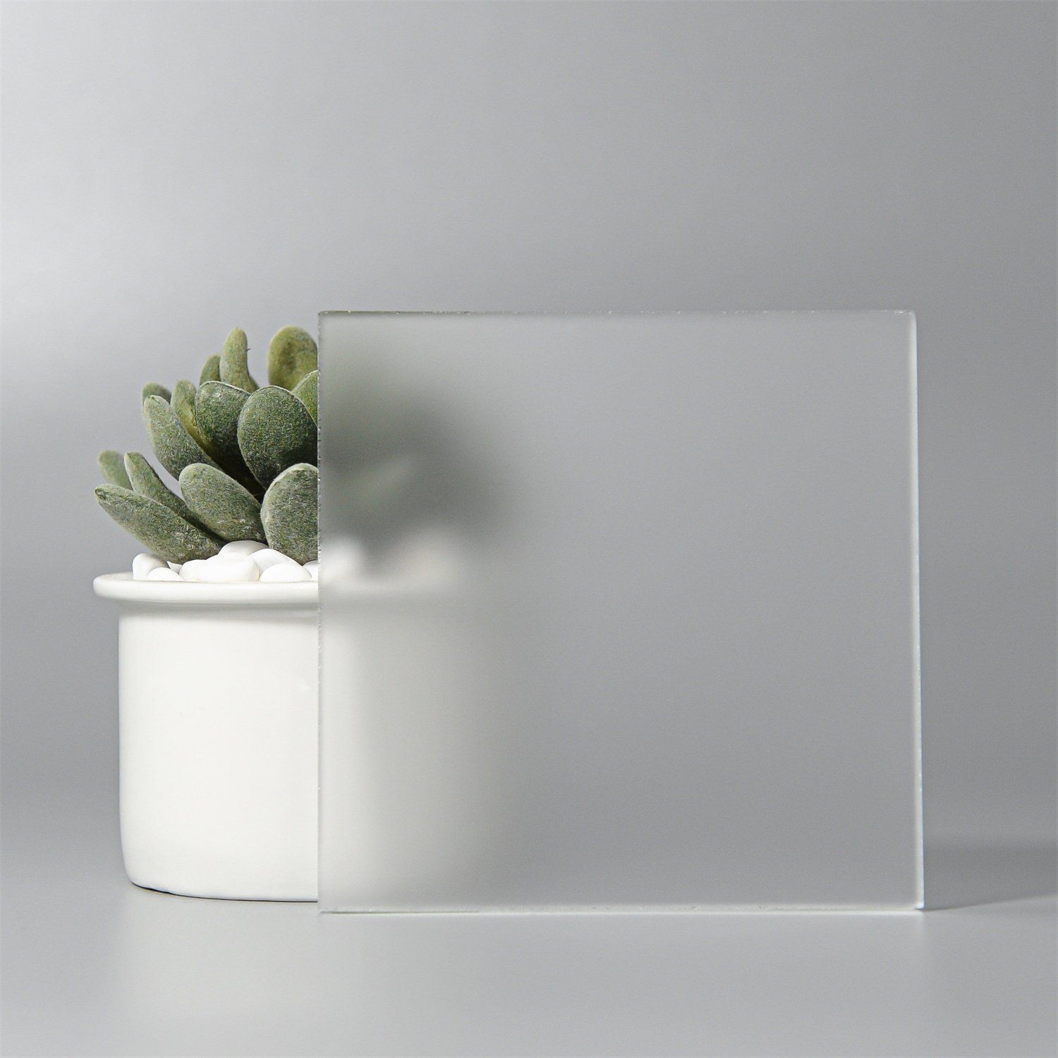
That looks closer to where things are today, with a lot of mainstream UIs that aren’t quite superflat going for that frosted, acrylic sort of aesthetic. Translucent but not transparent.
Examples from Windows 11 and iOS 18:
See also some of the transparency and active transparency in KDE 5 (and friends): https://discuss.kde.org/t/krusader-and-kvantum-transparency/17533
WIN10 ACRYLIC MENTIONED
…used before they frankensteined in the fluent around win11’s rollout 😔